
FindMe Tag
A search and rescue system for natural disasters.
Explore
A refreshed version is in progress. You're welcome to look around, but some content and polish are still being finalized.
An exploratory dashboard for public health researchers analysing Covid-19 as a syndemic, combining epidemiological data with the socio-economic context around it.
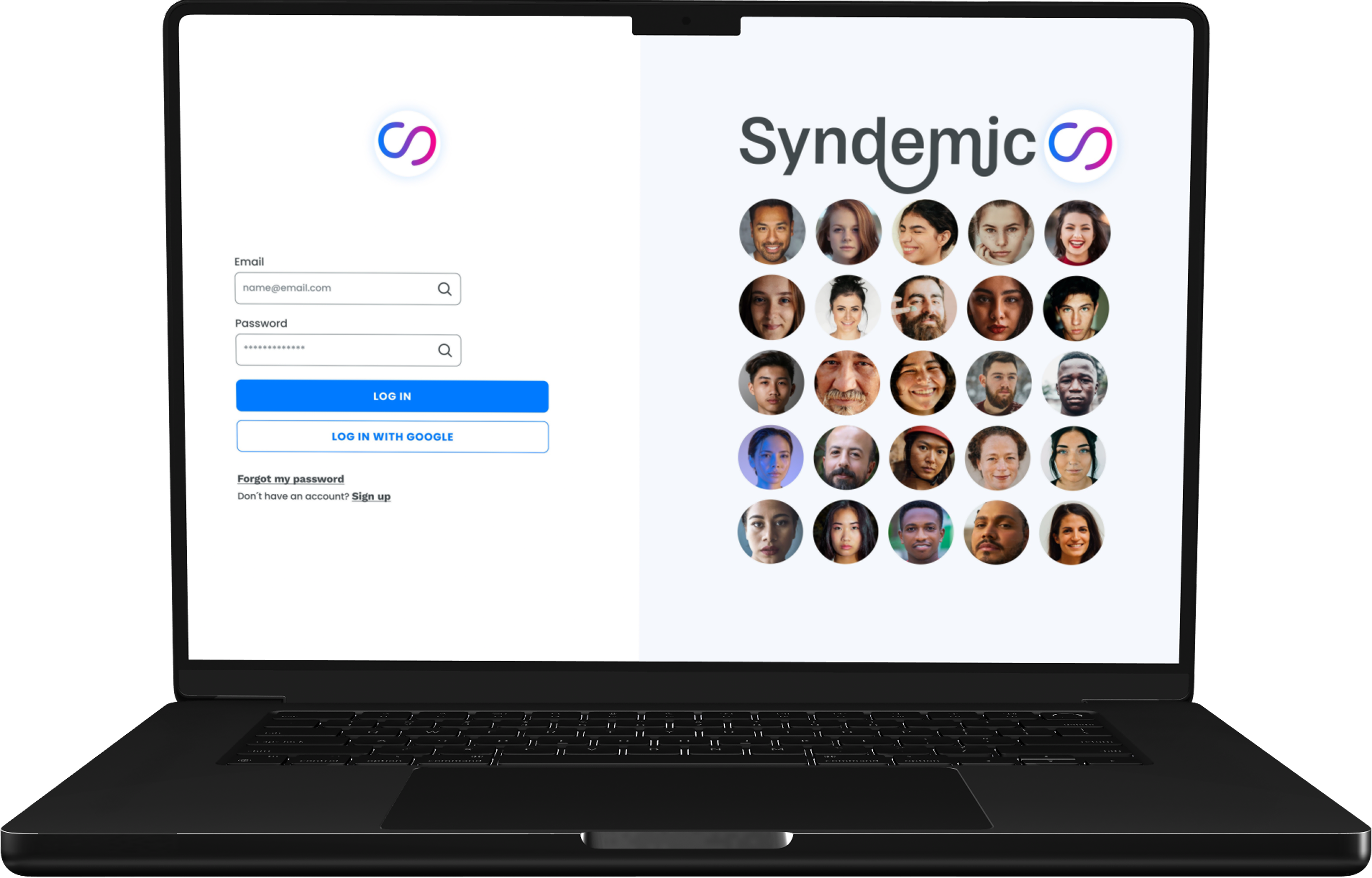
An exploratory dashboard for public health researchers analysing Covid-19 as a syndemic. Built to help them find trends, spot patterns, and make predictions by combining epidemiological data with the socio-economic context around it.
An exploratory dashboard for public health researchers studying Covid-19 as a syndemic, surfacing connections between epidemiological data and the socio-economic context around it. Researchers can compare indicators across country, regional, and district levels, annotate the map, save views, and share findings with collaborators. Designed in collaboration with researchers at IUR and K3 (Malmö University), with data sourced through the University of Oxford.
A syndemic frames disease as something shaped by political, social, and economic conditions, not just biology. Most Covid dashboards visualised the virus. None of them visualised the conditions around it.
“Design a dashboard that helps researchers analyse Covid-19 as a syndemic, by combining epidemiological data with socio-economic context.”
During Covid-19, research teams were working with dashboards that visualised transmission data: curves, maps, case counts. Useful, but incomplete. The syndemic framework argues that disease doesn't spread in a vacuum. Political decisions, housing conditions, employment patterns, and social inequalities all shape how an outbreak behaves in a specific place. Existing tools didn't connect those dots. Researchers were making the connections manually, across separate systems, which slowed analysis and obscured patterns that should have been visible.
Visual 2 — the gap
A side by side comparison: a generic Covid dashboard from 2020 (JHU or similar) on the left, and your dashboard on the right. The visual makes the argument before the reader has to read it.
Existing tools showed transmission. Syndemic was designed to show why.
Two things, layered.
First, the audience was the constraint. Designing for researchers means designing for open-ended inquiry. The dashboard couldn't pre-bake conclusions, couldn't visualise data in ways that implied a finding before the analysis happened. Heat maps, for instance, look authoritative and were ruled out for exactly that reason. Every design decision had to leave the interpretation to the user.
Second, the data was genuinely heterogeneous. Epidemiological indicators and socio-economic indicators don't behave the same way. Population density at country level is almost meaningless. At district level it reshapes the analysis. Income distribution looks different at municipal scale than at regional scale. Combining datasets in a single tool meant designing around the fact that the same indicator can change in significance depending on zoom level. The map wasn't the visualisation, the map was an interaction.
Desk research first: dashboard anatomy, data visualisation, visual cognition, the role of storytelling in research tools. Then fieldwork. Seven interviews with researchers across the qualitative and quantitative spectrum, plus an on-site observation with the IUR, K3, and DVMT teams to see how research workflows actually run. Affinity diagramming surfaced four clusters: customisation, simplicity, understanding, and togetherness. Co-design workshop with researchers tested specific design choices around indicators and dashboard configuration. Hi-fi prototype in Figma, user tested.
Visual 3 — fieldwork
Photo from the co-design workshop or observation session. Whiteboard with researchers' indicator notes, workshop materials, or sketching desk image.
Co-design workshop with researchers from IUR and K3.
Visual 4 — the affinity map
Restyled affinity diagram showing the four clusters (Customisation, Simplicity, Understanding, Togetherness). Strip the original sticky-note styling, redraw in black, white, and orange.
Synthesis of seven research interviews. Customisation was the dominant theme, but the four clusters drove every subsequent design decision.
The default model for a Covid dashboard in 2020 was the news dashboard: large numbers, animated curves, regional heat maps, daily updates. That model assumes the user is a reader looking for a takeaway. Researchers aren't readers. They're asking their own questions, and a dashboard built around takeaways gets in their way.
Syndemic was built as a workspace, not a report. Researchers can compare two views side by side, annotate the map directly with notes that persist, save and pin specific configurations to return to later, invite collaborators into a shared view, and export findings to continue analysis elsewhere. None of these features are flashy. All of them are what fieldwork showed researchers actually do when they work, and what existing pandemic dashboards refused to support.
The decision to remove heat maps came directly from the co-design workshop. Heat maps imply a finding. Researchers wanted to be the ones drawing that finding, not the dashboard.
Visual 5 — Compare
A small screen state showing the side-by-side comparison view.
Visual 5 — Annotate
A small screen state showing direct annotation on the map.
Visual 5 — Collaborate
A small screen state showing a shared view with a collaborator's note.
Visual 5 — Save and Pin
A small screen state showing saved and pinned configurations.
The co-design workshop surfaced something I had underestimated. The same indicator can be useful at one map level and meaningless at another. Population density at the country scale flattens out the pattern that makes it interesting at the district scale. Some socio-economic indicators only exist at municipal granularity. Some epidemiological indicators only exist at national level.
“Some indicators only mean something at the right scale.”
The dashboard was structured around three map levels: country, regional, municipality and district. The available indicators change as the researcher zooms. Moving between levels isn't a navigation action, it's an analytic action. The dataset itself reconfigures around the question being asked.
Visual 6 — country / regional level
The map at country or regional zoom, with indicators appropriate for that scale visible in the side panel.
Visual 6 — district level
The same map at district zoom, with a different set of indicators visible in the side panel.
The dataset reconfigures around the question being asked.
Visual 7 — clean state
Map view before any annotation.
Visual 7 — mid-annotation
A researcher annotating directly on the map.
Visual 7 — shared view
A shared workspace with a collaborator's note visible.
Annotation, save, and collaboration features were the core of the workspace argument. They moved the dashboard from a thing to read into a thing to think with.
Hi-fi Figma prototype, tested with researchers. Testing surfaced three concrete improvements: a search field would outperform the dropdown for indicator selection, a horizontal time visualisation would expose day-by-day relationships the current view hid, and the comment section needed consolidation so researchers could read all annotations in one window.
The user testing also confirmed the bigger bet. Researchers responded to the inquiry framing, the annotation tools, and the level-aware indicators. The features that look like they're not doing much, the saving, the side-by-side comparison, the absence of heat maps, were the ones they noticed first.
Visual 8 — validation findings
Four insight cards in a grid. Plain text cards, not screenshots. Headlines: 'Search beats dropdown', 'Horizontal time view', 'Consolidated comments', 'Workspace framing validated'.
I'd build qualitative data into the architecture from the start. The researchers I worked with use qualitative and quantitative methods together, but the prototype only supported quantitative indicators. That wasn't a feature gap, it was a structural decision made too early. Adding qualitative data later would mean rebuilding the indicator system, not extending it.
