
AI diagnostics for digital dentistry
UX/UI design for a professional dental workflow product.
Explore
A refreshed version is in progress. You're welcome to look around, but some content and polish are still being finalized.
A mobile app that helps people find bars and cafés with sunny outdoor seating in Copenhagen.

In a city where sun defines an afternoon out, the difference between a sunny terrace and a shaded one is the whole reason for choosing one place over another. No existing tool answered that question from the street.
A mobile app that helps people find bars and cafés with sunny outdoor seating in Copenhagen.
The product is built around two ideas: that the right coordinate for a sun recommendation is the terrace, not the venue address, and that the right interface for a probabilistic model is four plain-language states, not a data layer.
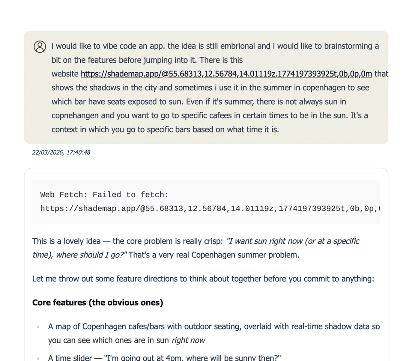
What makes this project worth writing about is the process. Sunquà was designed through a workflow that does not fit the standard sequence of research, strategy, design, handoff. Product decisions, technical architecture, feature scope, and UX logic were developed conversationally with AI before a single Figma frame or line of code existed. That shift, using AI as a thinking partner throughout rather than only as a production tool at the end, is the thread that runs through this case study.
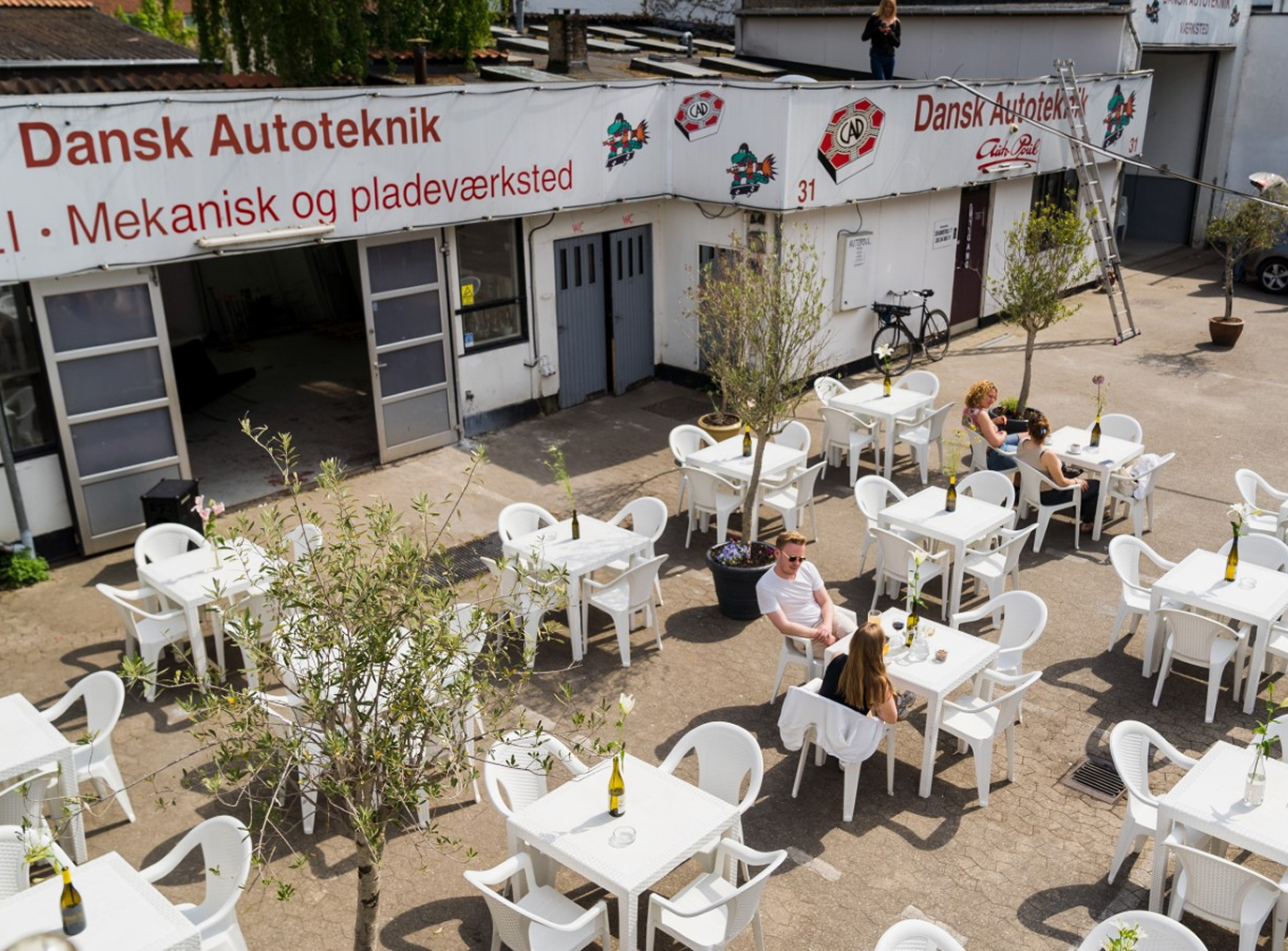
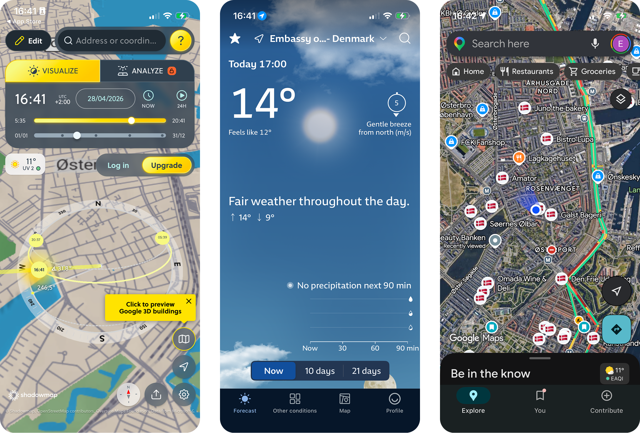
Take ShadowMap's data, which is built for architects and urban planners, and reframe it for a person standing on a corner deciding where to get a beer. Same underlying data, completely different product. That reframing was the whole project.
Weather apps confirm the sun is out somewhere. ShadowMap shows shadows but expects you to interpret them. Google Maps shows venues but knows nothing about light.
The gap was specific and small: turn solar geometry, and building data, into a recommendation a person can act on without learning anything.
Product definition came first, in conversations with Claude over several long sessions. Two user types, one core promise, four interaction states, and a roadmap built around proving the hardest thing first rather than the most visible thing.
The hardest thing was not the map or the UI. It was whether terrace-level sun recommendations would be accurate enough that people would trust them and act on them. So the first work was a curated venue schema and a rough working model to test the math, not a polished screen.
From there, implementation moved to Codex, building outward from the recommendation layer to the map, the venue detail, and the trust features. Each step had a single product question attached. Nothing shipped until that question was answered.
THE ROADMAP
Each phase only exists because of a single product question. Ship nothing until that question is answered.
PHASE 01
Data trust
Do I trust every venue on the map?
PHASE 02
Design polish
Does this feel obvious to a first-time user?
PHASE 03
Dataset freeze
Which venues make the cut for v1?
PHASE 04
Pipeline
Will the data stay fresh on its own?
PHASE 05
Device QA
Does it actually work on a real iPhone?
PHASE 06
Launch ops
Could a stranger trust this enough to install it?
PHASE 07
App Store
Will Apple let it through on the first try?
Two things, layered.
First, accuracy. Sun position math is solved. The problem was that “sun position at the venue” is the wrong question. The right question is “sun position at the actual outdoor seats,” which can sit ten metres away from the front door and behind a different building. A model that's technically correct at the wrong coordinate is worse than no model at all, because it produces confident, wrong recommendations. The accuracy bet had to be made at the data layer, not the calculation layer.
Second, communicating uncertainty without losing trust. The underlying model deals in probabilities and partial states. Surfacing that complexity to a person standing on a street corner would defeat the product. Hiding it would lie. The interface had to feel confident without claiming a precision the model couldn't back up.
The default move when building anything venue-based is to use the venue's address as the coordinate. Address is what Google Places, Foursquare, and OpenStreetMap return. It's what every mapping tutorial assumes.
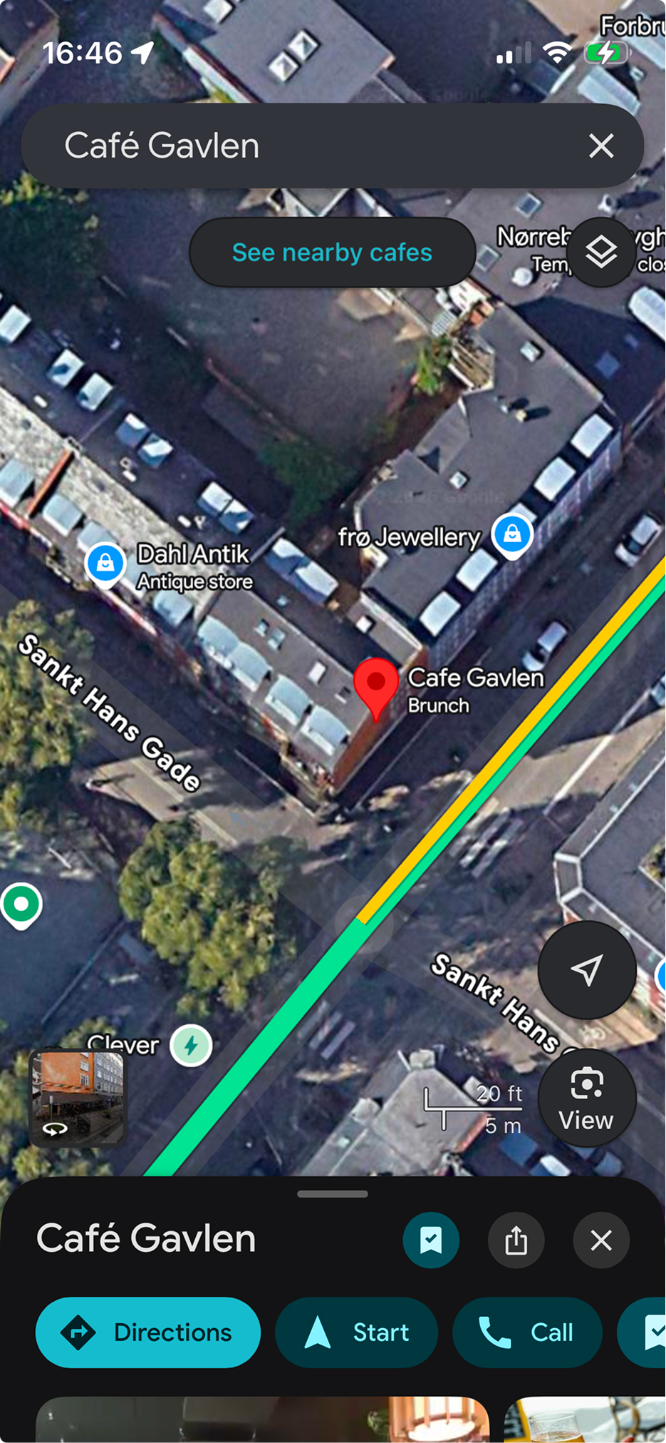
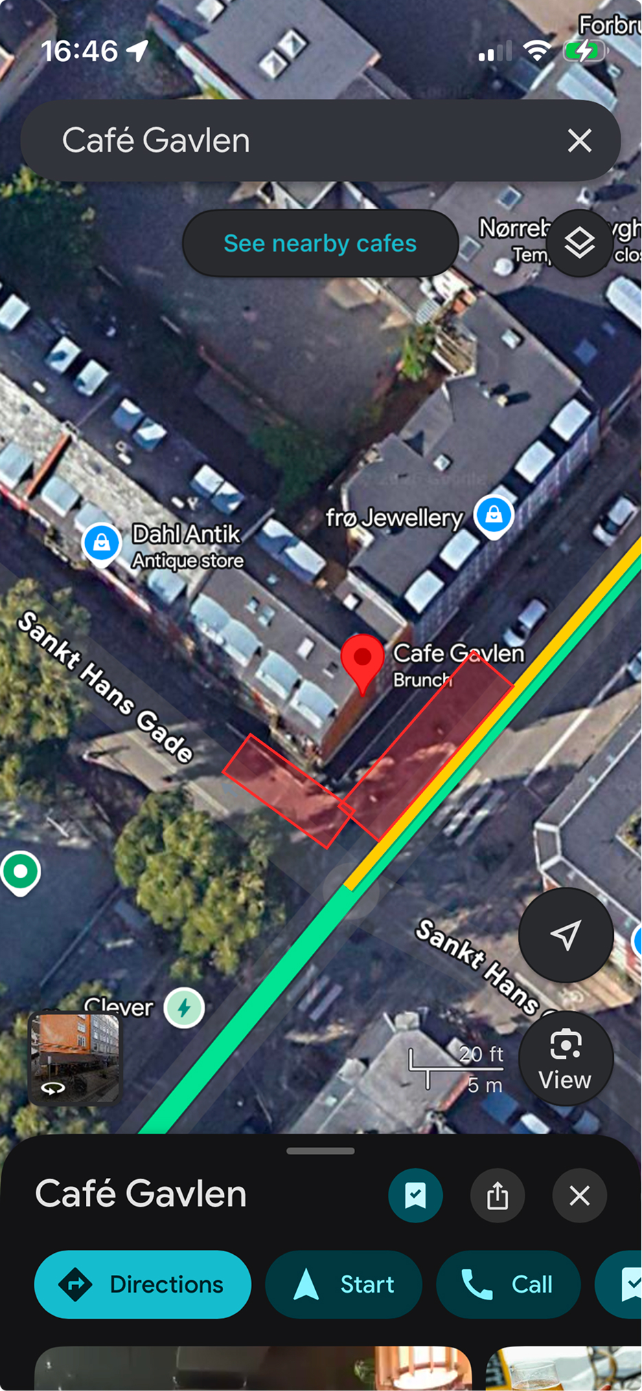
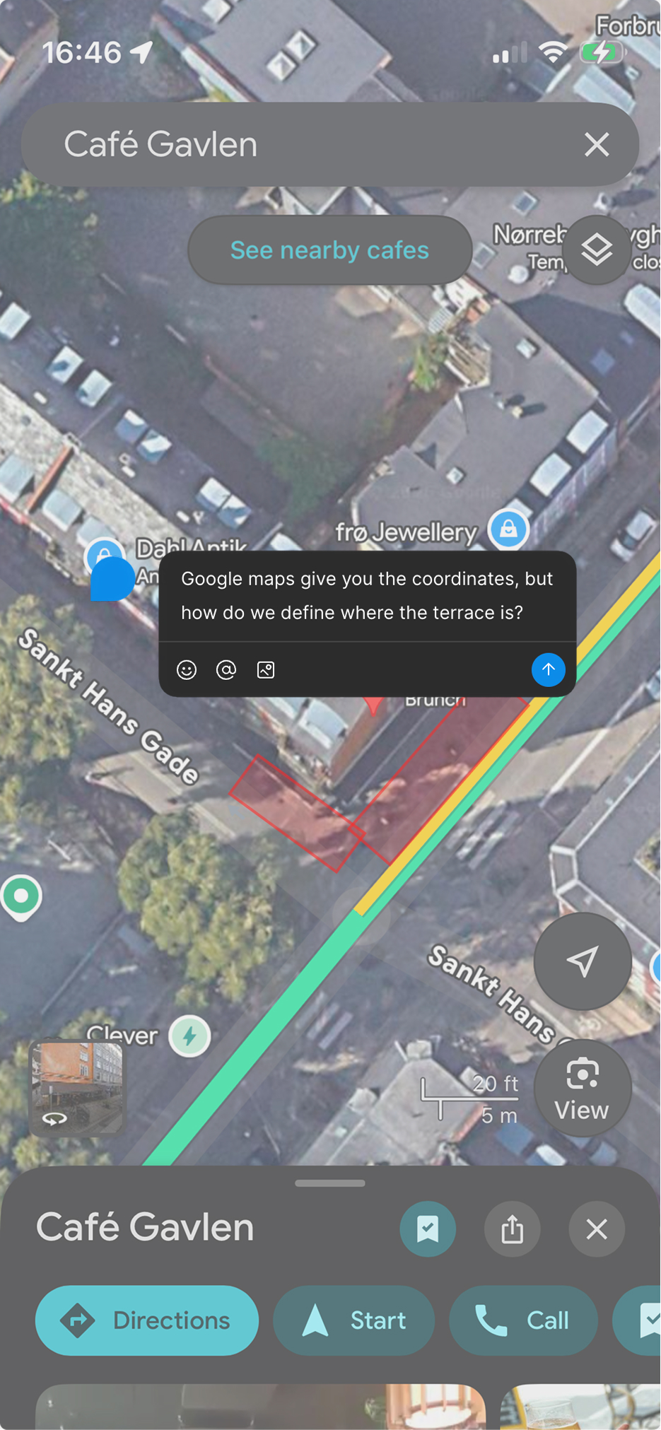
Every venue in the dataset has a hand-placed terrace coordinate, identified through site visits, satellite imagery, and manual review. That single decision is the reason the recommendations work. It's also the reason the dataset is small and Copenhagen-only. Coverage was deliberately traded for accuracy, because in this product, accuracy is the product.
The model under the hood deals in solar geometry, building occlusion, and time-of-day variance. None of that helps someone choose between two cafés in the next ten minutes.
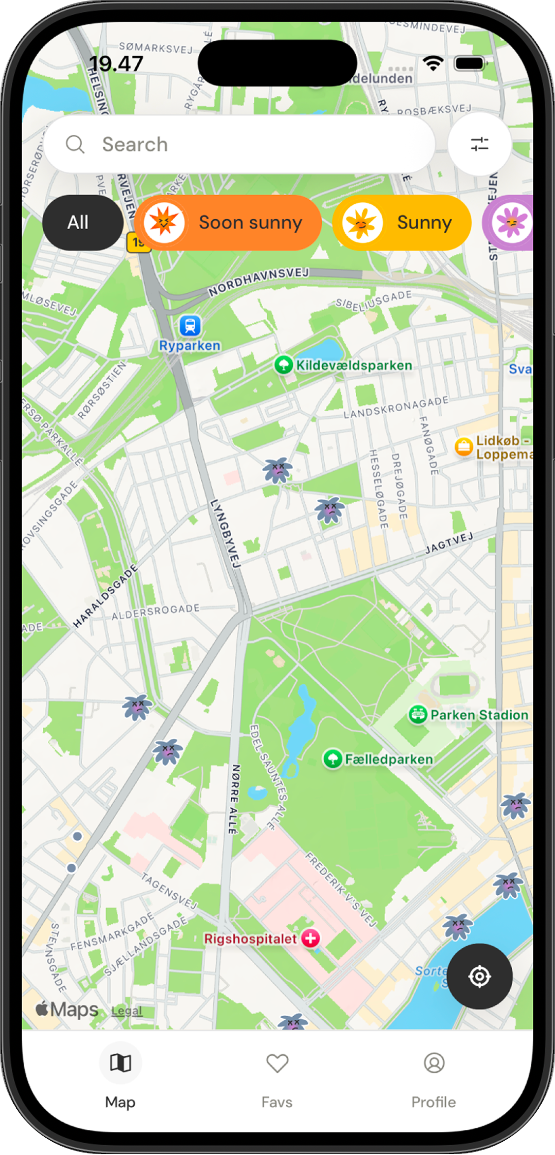
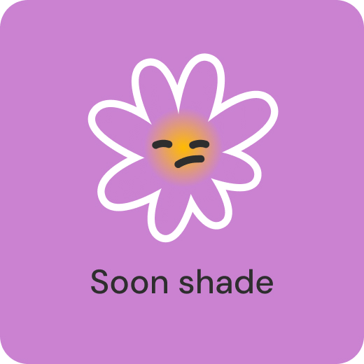
The user-facing language collapses all of it into four states: Soon sunny, Sunny, Soon shade, Shade. These drive every surface in the app: the map markers, the venue cards, the per-venue timeline, and the filters. The states are decisions, not measurements. They smooth over the messier reality of the model while still giving the user enough to act.


What I take from this project is less the product than the working model. The role of a product designer is shifting from executor to orchestrator, with AI collapsing handoffs and letting one person run end to end work that used to require a team.
Sunqua was my version of that shift. I brought AI into the product definition phase rather than reserving it for execution, which let me explore framings in parallel, pressure test scope faster, and keep the rationale on the page instead of scattered across meetings.
The judgment did not change. Choosing between ten generated variants still requires knowing the user, the trade offs, and what trustworthy looks like. What changed was the surface area one designer can responsibly cover, and how visible the reasoning becomes by default.
The roadmap is shaped around three product questions, each one a step the v1 deliberately didn't take.
The current recommendation is geometry-only. Adding live cloud cover from Open-Meteo would make the model honest about the most common reason a sun-line doesn't deliver. This is the next feature, and the most important one for accuracy.
Sun alerts for saved venues turn Sunquà from a thing you open into a thing that tells you. Premium feature, opt-in per venue.
The behaviour around finding sun is rarely solo. Friends, shared planning, and group time slots are on the roadmap as a separate product question, not a feature add. They reframe the core loop.
Beyond that, a venue partner dashboard and expansion to other cities sit further out. Both depend on the curated dataset model holding up, which is itself the question the v1 was built to answer.
